Why Brand Guidelines Cause Rejected Jobs
A customer sends a 40-page brand guidelines PDF with a logo order. The job is a cap, a polo and a pen. Somewhere in those pages are the exact colors, the minimum logo size, the clear space and the rules for dark backgrounds. Miss one, and the finished product gets rejected, even though it matches the file you were sent.
Brand guidelines are written for marketing teams, not production. Here's what to pull out of them before artwork starts, whether you're searching for brand guidelines for print production or reading one for the first time.
Start With the Logo Rules
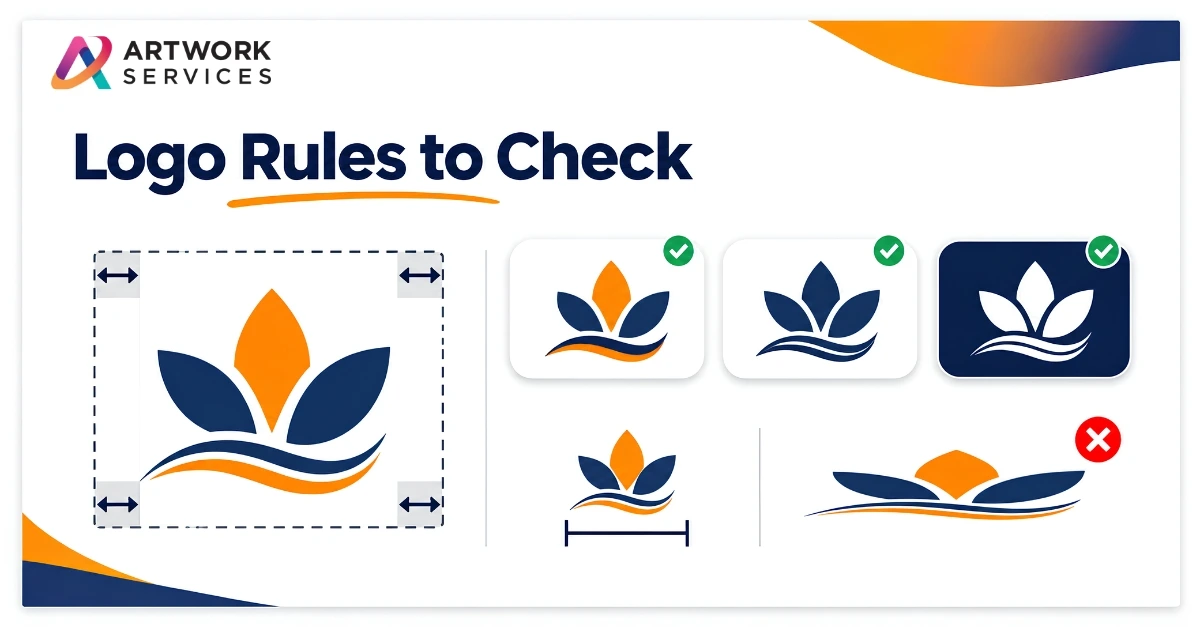
Look for the approved versions of the logo: full color, one color, black, white and reversed. Then check the rules around them:
- Clear space: the empty margin the logo needs around it
- Minimum size: how small the logo may appear
- Do-not list: stretching, recoloring, adding effects or changing the layout
A small embroidered cap and a large banner may need different approved versions.
Pull Out the Colors
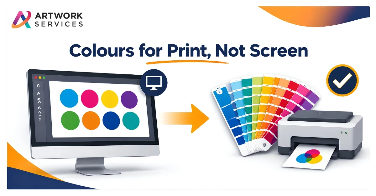
Guidelines often list colors in several systems. Check which are given, and note:
- Pantone references for exact brand colors
- CMYK values for full-color print
- RGB or hex values, which are for screens only
- Which colors are primary and which are accents
If only RGB is listed, ask the customer for a print reference. Don't guess.
Check Fonts and Text Rules
Note the brand typefaces, any approved alternatives, and how taglines or logo lockups must be set. If a font isn't supplied, ask for it or for outlined artwork.
Note the Method Limits
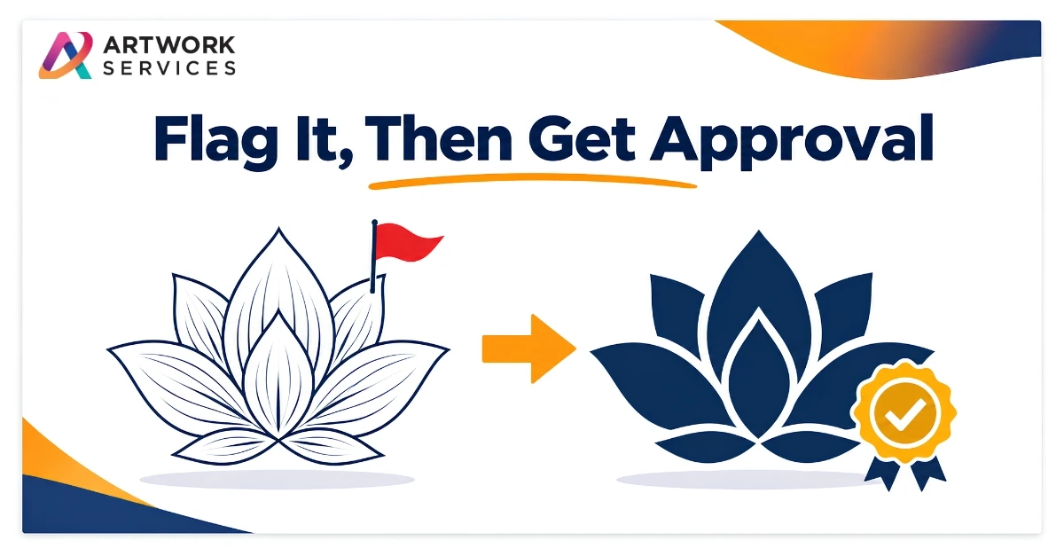
Guidelines rarely cover decoration methods. A logo with fine lines or gradients may need a production version for embroidery, screen printing or pad printing. Where a change is needed, flag it and get approval before production, so the customer decides, not the shop.
Where Artwork Services Fits
At Artwork Services, careful setup is part of the job. Our Vector Artwork service rebuilds logos by hand into clean, scalable files with Pantone color matching, delivered in AI, EPS, PDF and SVG formats. Our Pre-Press team handles artwork correction and optimization and prepares press-ready files for the method you're using. For stitched work, Embroidery Digitizing turns the logo into a stitch file by hand.
You can see examples in our portfolio.
What's the guideline detail that most often trips up your jobs: colors, minimum size or clear space? Tell us in the comments.
If a customer's guidelines and their logo file don't quite match, send your artwork and the guidelines to Artwork Services. We'll prepare it carefully and get it ready for production.