
Why Artwork That Looks Refined on Screen Falls Apart in Print
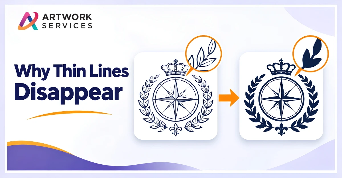
A logo has a delicate outline, a tagline in small letters, a few fine lines inside the icon. On screen it looks refined. After production, the outline is gone, the tagline is a smudge, and the fine lines have filled in. The artwork didn't change. The method just can't hold that much detail.
If you're searching for the minimum line thickness for printing, the honest answer is that there isn't one number. It depends on the method, the material and the size. Here's how to think about it before a job goes to production.
Why Thin Lines Disappear
Every method has a limit on what it can reproduce:
- Screen printing: ink spreads and fine lines can fill in or break up
- Embroidery: thread has width, so a hairline can't be stitched as drawn
- Cutting and engraving: a blade or beam can't follow detail smaller than its own width
- Pressed marks (debossing, embossing): hairlines tend to vanish or fill in
A line that is clear at full size on screen may be a fraction of that on a pen, a cap or a pocket.
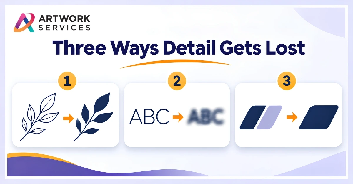
Three Common Problems
Thin outlines. A fine border disappears or prints unevenly, especially on textured or curved surfaces.
Tiny text. Small letters close up, so a tagline becomes unreadable.
Tight gaps. Narrow spaces between shapes fill in, merging details that should stay separate.
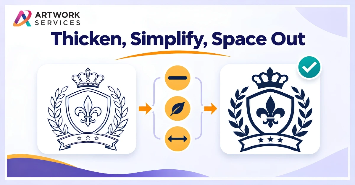
How to Adapt Artwork for the Method
- Thicken key lines so they hold at the final size
- Remove or simplify details that add no meaning
- Increase spacing between elements that touch or nearly touch
- Enlarge small text or drop it from the small version
- Check the final size, not the screen size
Ask your print or decoration partner for the minimums of the method you're using. They vary, so a general number can mislead.
Where Artwork Services Fits
At Artwork Services, the same logo isn't treated the same way for every job. Our Pre-Press team handles artwork correction and optimization and prepares press-ready files for screen printing, DTG, sublimation, offset and digital printing. For stitched work, Embroidery Digitizing sets the stitch details by hand for the garment. If the original is too rough to adjust, our Vector Artwork service redraws it as clean, scalable artwork.
You can see examples in our portfolio.
Which gets lost first in your jobs: thin outlines, tiny text or tight gaps? Tell us in the comments.
If a design has fine detail and you're not sure it will hold, send your artwork to Artwork Services. We'll adapt it to your method and get it ready for production.